In PhotoShop, I learned how to edit text, cut out images, move pictures to a different background, and much more! My favourite projects were the magazine, oil painting, and movie poster assignments. I enjoyed the assignments that included art and design.
I used the Mixer Brush Tool to create the "oil painting" affect on a normal image. I actually made two versions of this project because the first version I made didn't look like an oil painting and looked exactly the same as the original image. I'm proud of making a second version because if I hadn't made it, I would probably regret it since the first version was not as good as the second version.This is definietly one of my favorite PhotoShop projects because I enjoyed coloring in the picture and watching the progress of the image slowly turn into an art piece. I also really like how the end product turned out. I can see myself making another one of these projects just for fun.
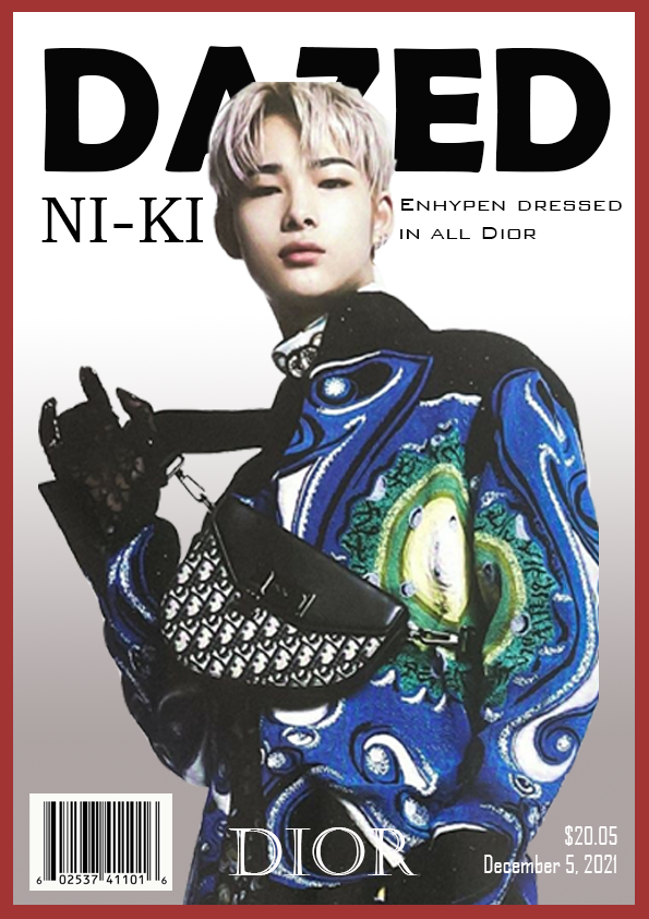
I used lots of tools to create this magazine, including the rectangle and text tool. Making this magazine was really fun and I enjoyed planning where to put everything. Some parts of making this project made me a bit stressed. For example, near the end of class, I found out that the person's head had to be behind the title. Which made me very stressed because I only had a few minutes of class left. Luckily, I was able to fix my mistake and hand the assignment in on time. Overall, this experience was very enjoyable and I would do this project again.
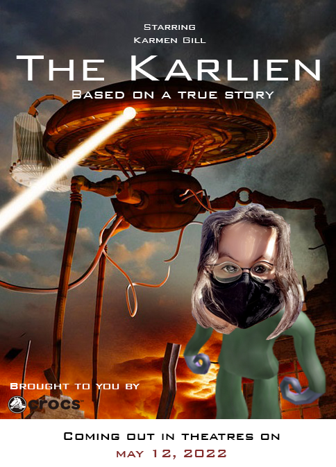
This poster was quick and easy to do. I looked at other movie posters for insporation! I got the idea to add the release date from a movie poster I found on the internet, I think it made the poster look more like a real movie poster. Finding a font that looked like a font that would be on a movie poster was also a really nice touch. I also added Crocs as the production company for the movie, which added a creative touch to the poster. The "alien" in this poster is a picture of one of my bestfriends, Karmen. I think this project came out very nicely and the process of making it wasn't too hard.

I made a realistic version of the house in Up for my creative choice project. It took me a while to choose what I wanted to do for my Creative Choice, so I thought about movies and decided to make a realistic Up house. Cutting out the original background of the house picture was a little bit of a challenge for me but I asked for help and eventually figured it out! The colors in all the photos were super vibrant and lively, which I think made this project look even better.
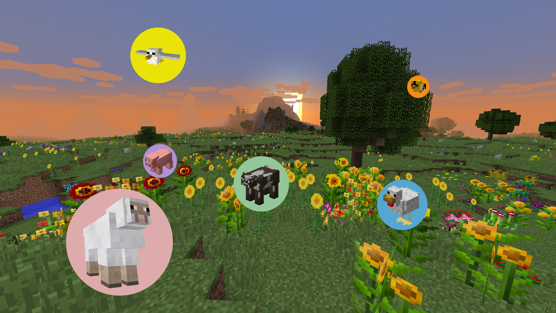
This project was stressful when I first started creating it because I didn't really know what I was doing. However, my teachers and peers helped me learn how to make this artwork. Hpwever, even after learning how to create this, I made the mistake of not putting a perfect circle behind each of the animals. I made the mistake of making the circles' ovals. Fortunately, I became aware of my mistake before it was too late. I'm proud of the end result and think it looks good.
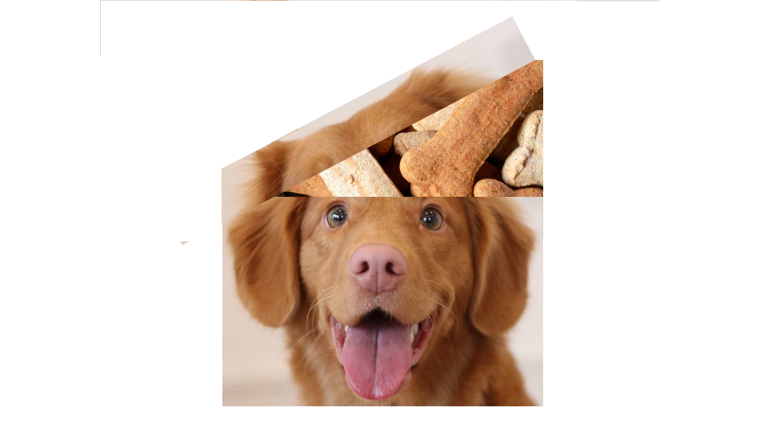
This assignment is of a dog thinking of treats. The hardest part for me was thinking of the idea. I didn't know what to make and how to make it. When I first strarted working on it, I was a little confused and unsure of how to continue. However, I tried a bunch of different techinques and finally figured it out. After I figured out what to make and how to makke it, it was pretty simple.
Go Back